The questions your role asks, and the reports that answer them.
Pick your function. Each question shows the example report that answers it or the part it answers, or says we have not built one yet.
Every report on this page is an example built on generated data. The company names, sites and figures are invented.
How we treat performance on your data
A feature that feels instant on a thousand rows proves nothing about fifty million. So we test performance-sensitive features on a reference model of about 49 million rows before we recommend them for your data. When your volume calls for it, we start with aggregations, incremental refresh and, on Microsoft Fabric, Direct Lake. DirectQuery comes last, for sources in the billions of rows, because each interaction then queries your database. Some features will not earn their place on your data. We make that call with you. Every engagement starts from your questions and your data, never from this page.
What and how are the easy half.
A report shows what a number is, and how it is built, with little extra work. A why is harder: the report has to be built around the split that answers it, and many reports are not. Each card says which kind of question it is.
What
What the number is, and where it sits.
How
How the figure is built, and how you would know it is right.
Why
Why it moved. The report splits the change into its causes.
Example
A page in the report answers the question.
Partial
A page answers part of it. The card names the part it leaves out.
No example yet
No report on our shelf answers it today. We show at most two per function.
These are the questions each role usually asks, as we understand them. They are a starting list, and no survey produced them. Discovery tests them with your own people.
Finance and controlling
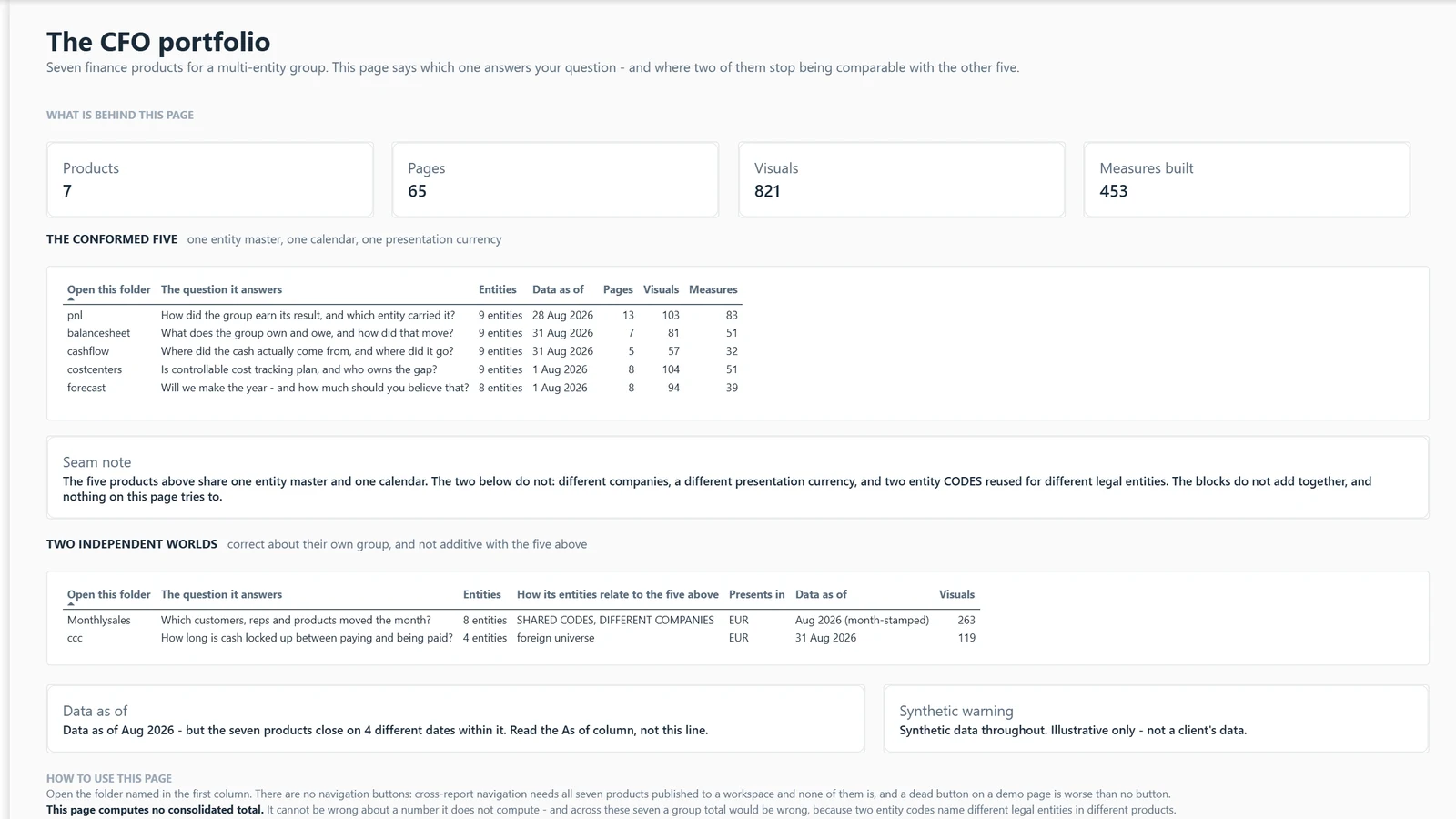
The deepest part of the shelf. Most of these reports share one generated group ledger. Read the function page →
WhyExample
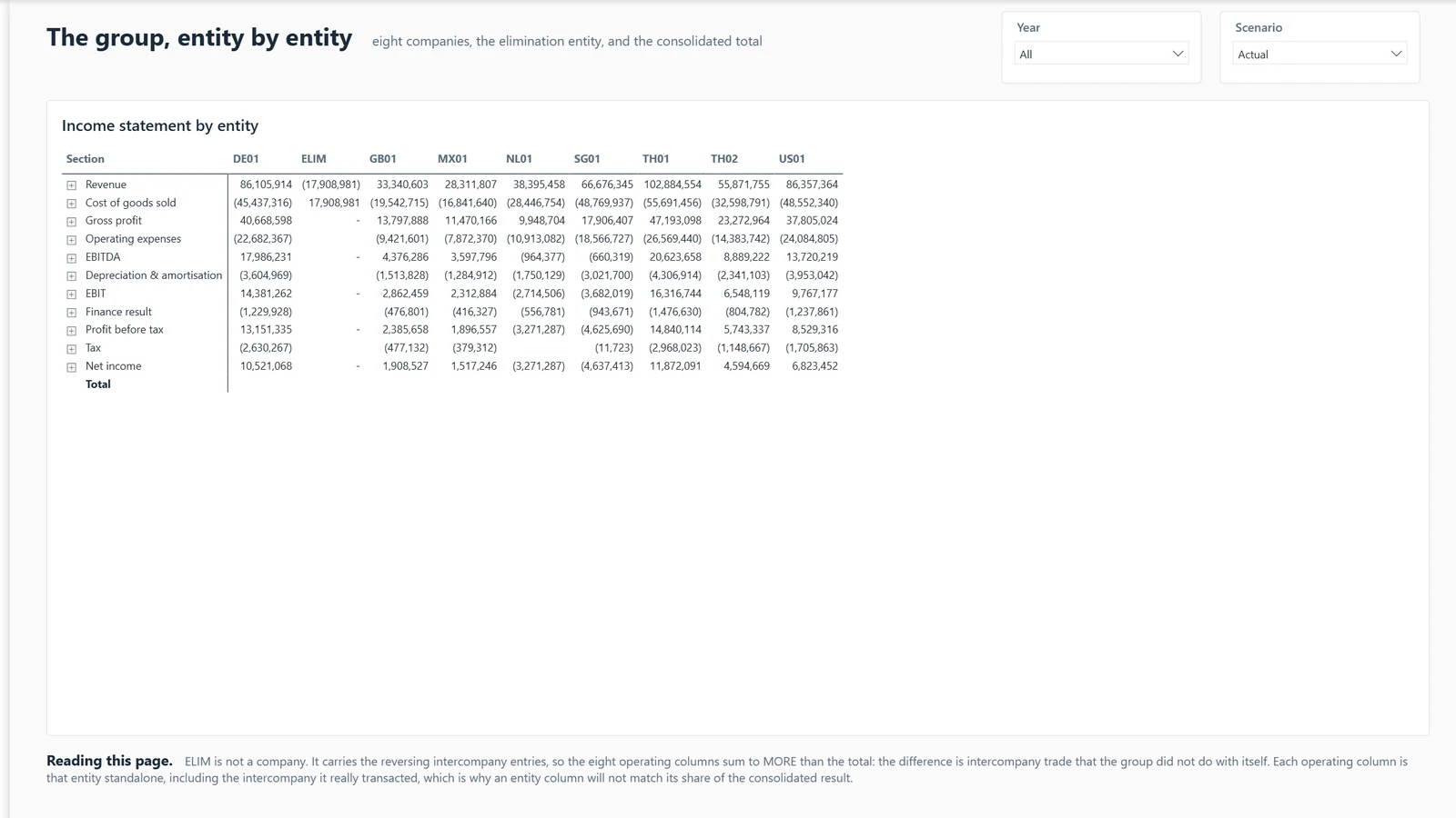
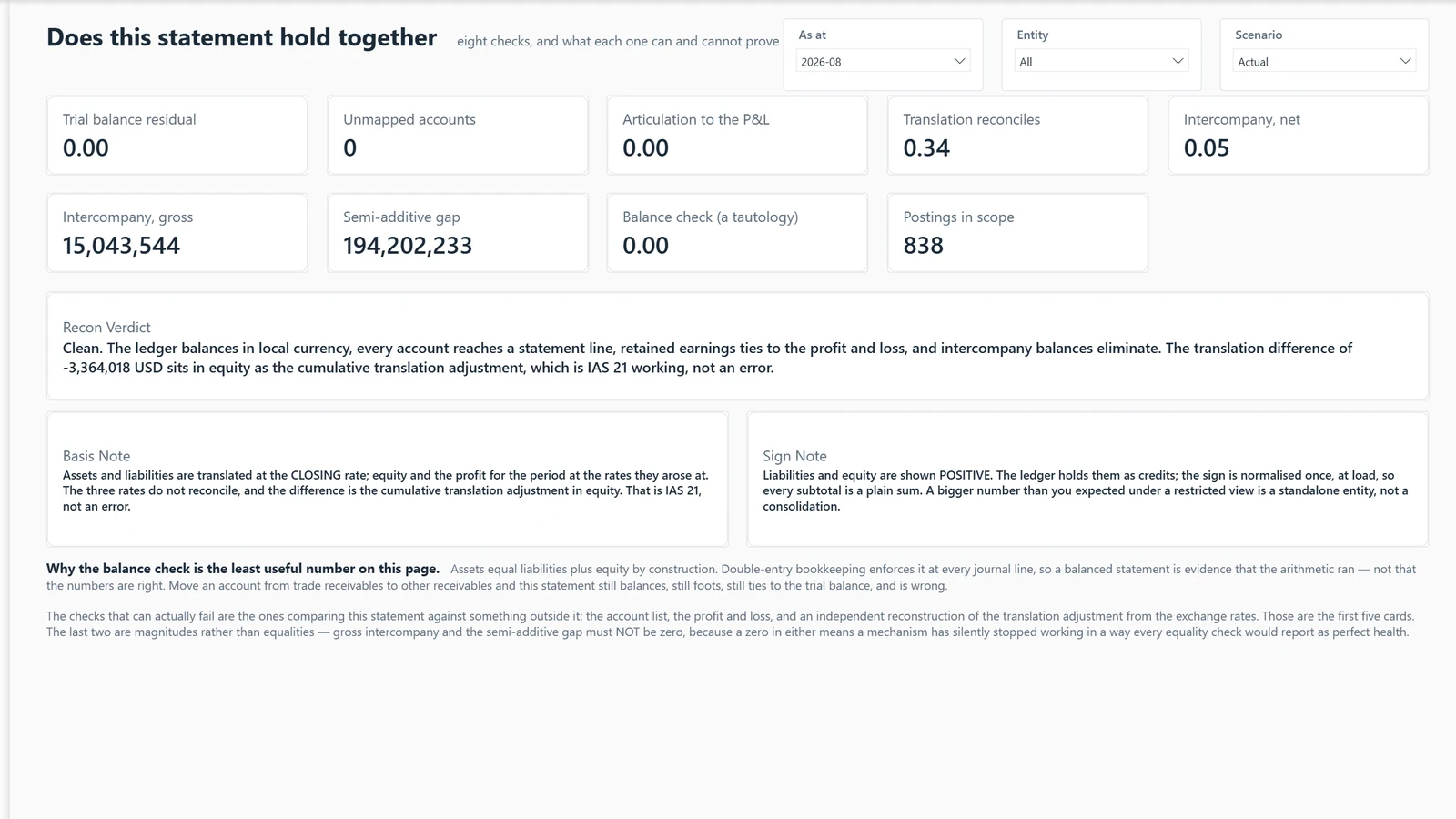
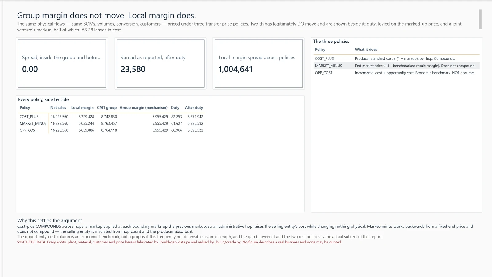
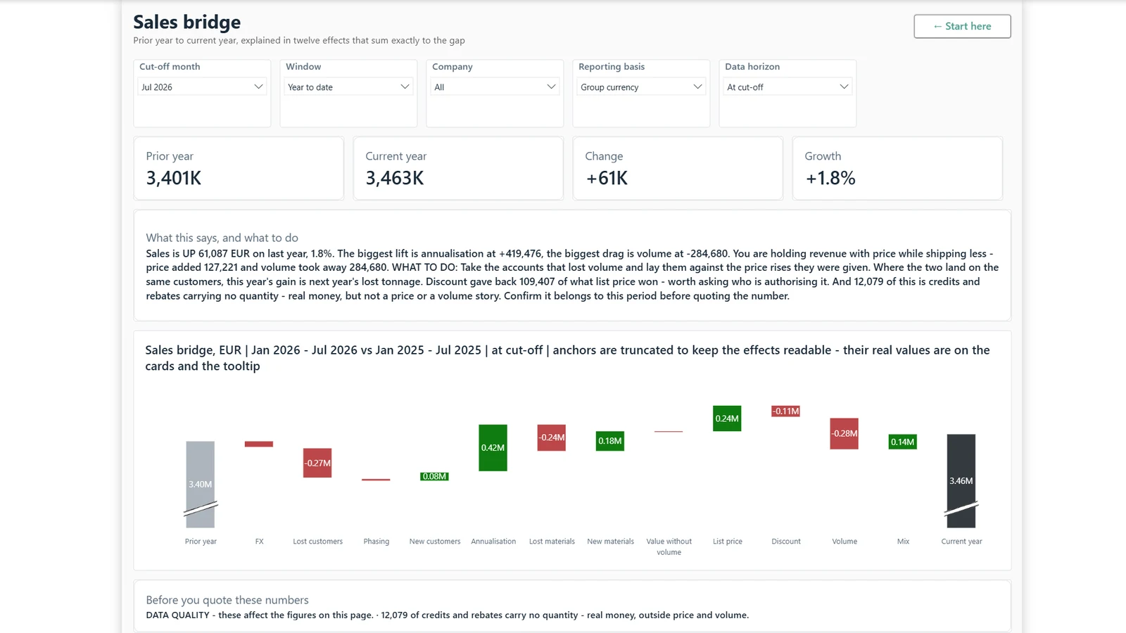
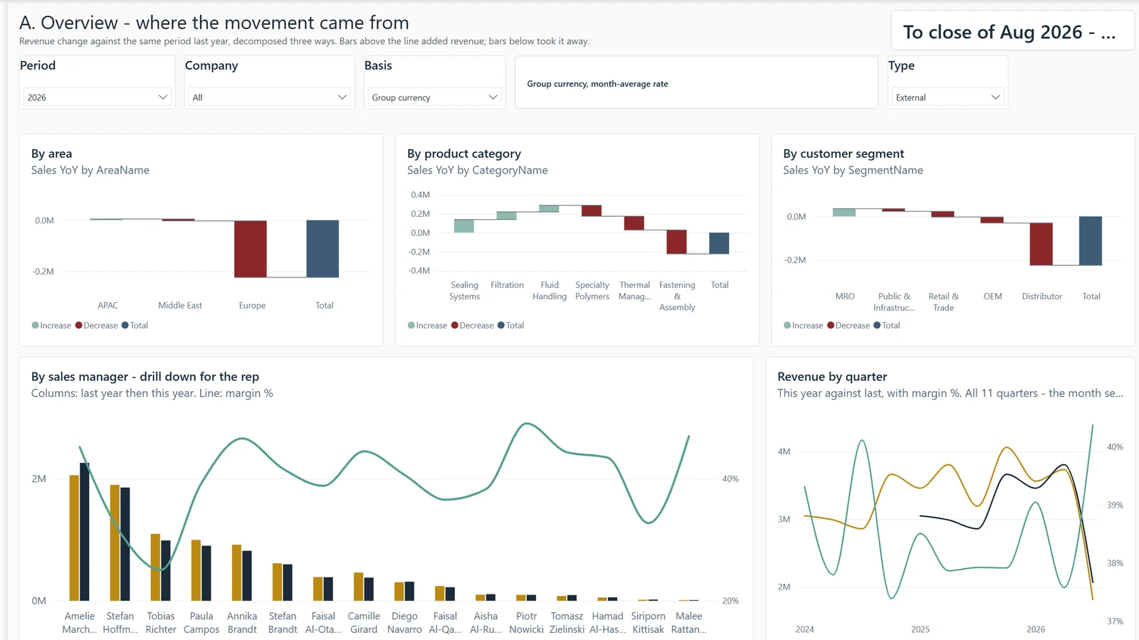
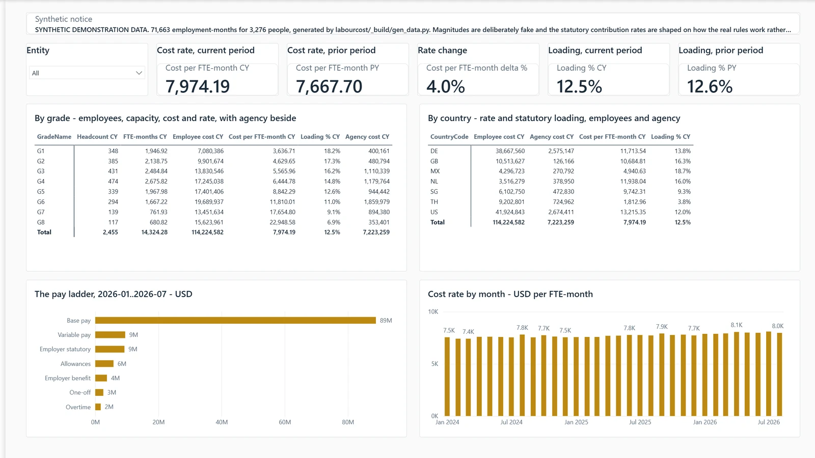
Group gross margin moved one point. Can I stand behind that, or is something underneath falling apart?
Example, generated data
P&L · 3 Entities
The Entities page splits the group move by entity. Three subsidiaries each lost 4.8 to 8.3 points while the group line moved 1.1.
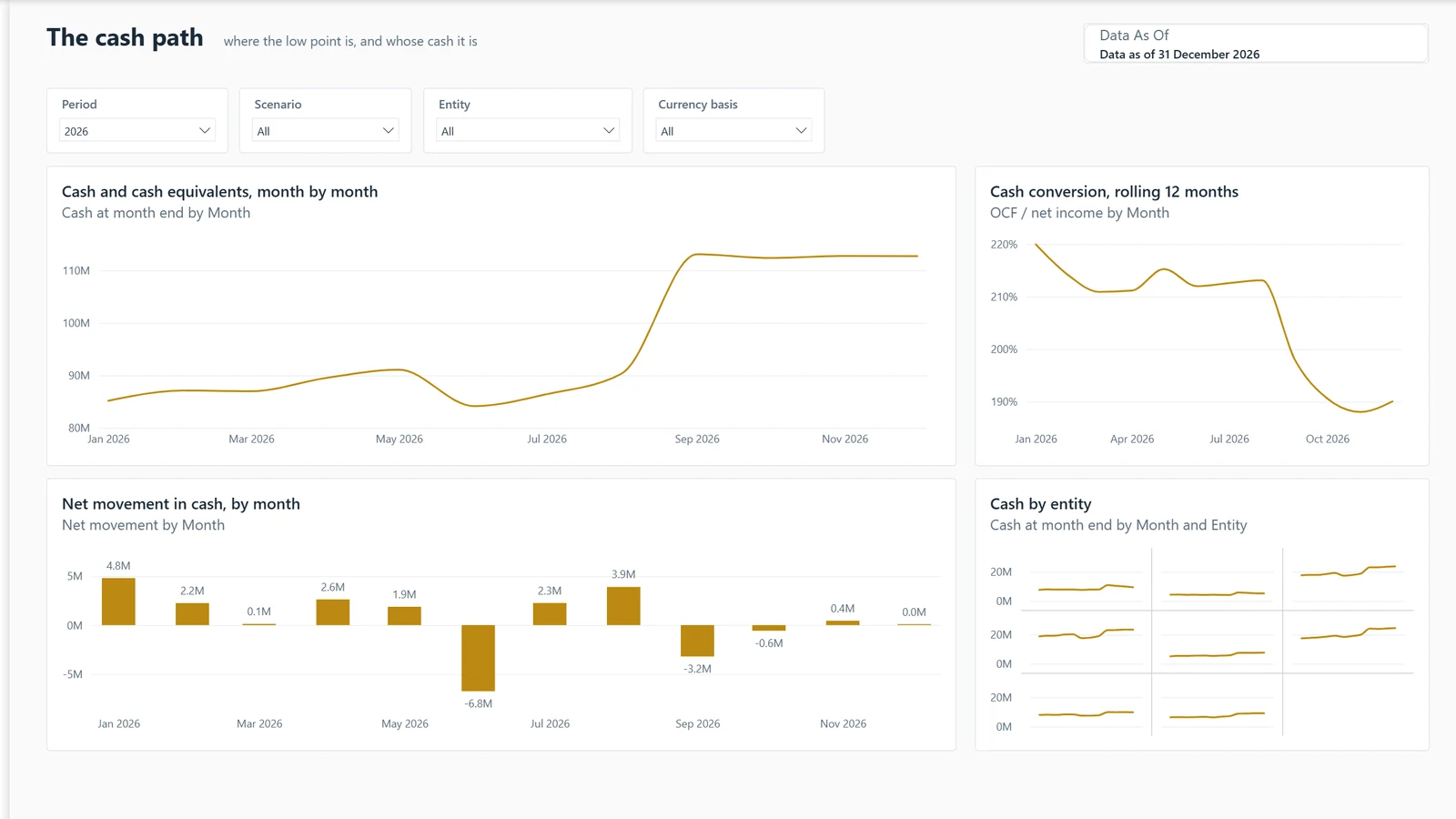
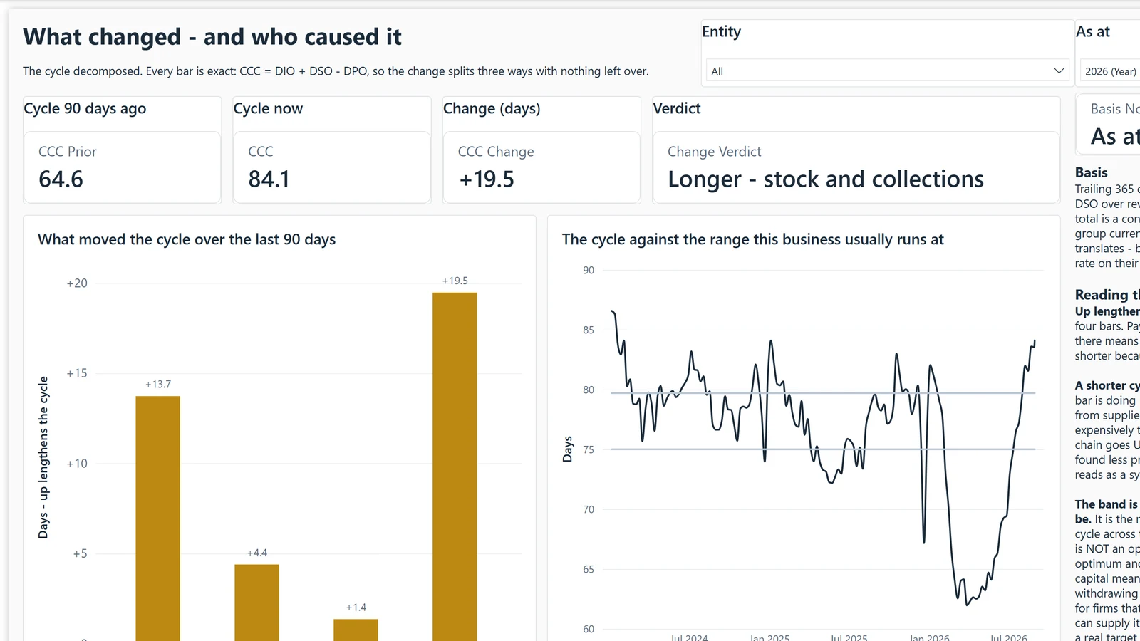
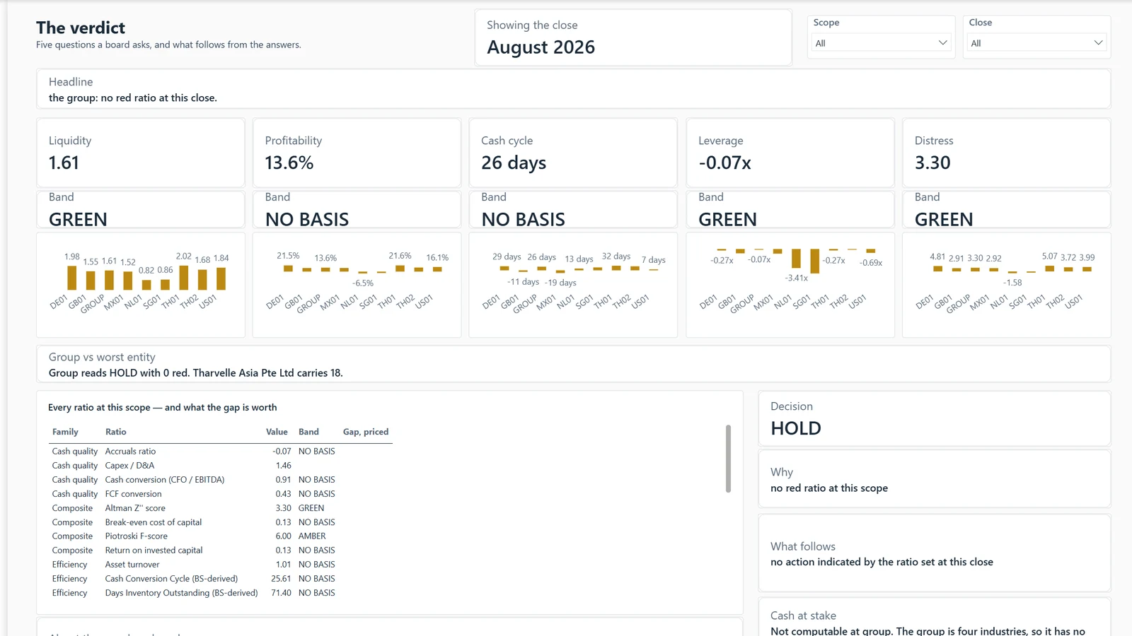
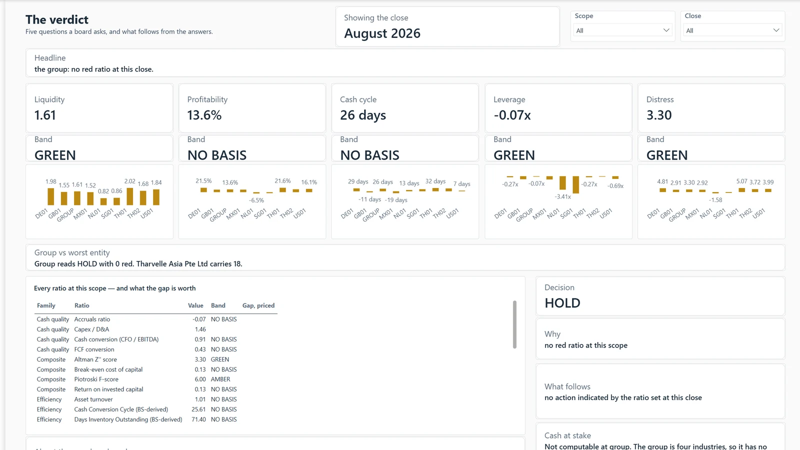
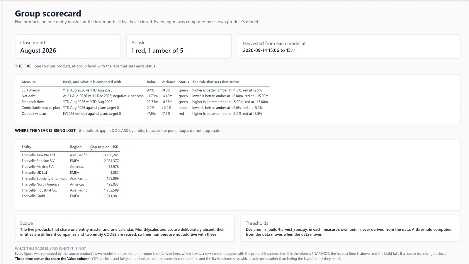
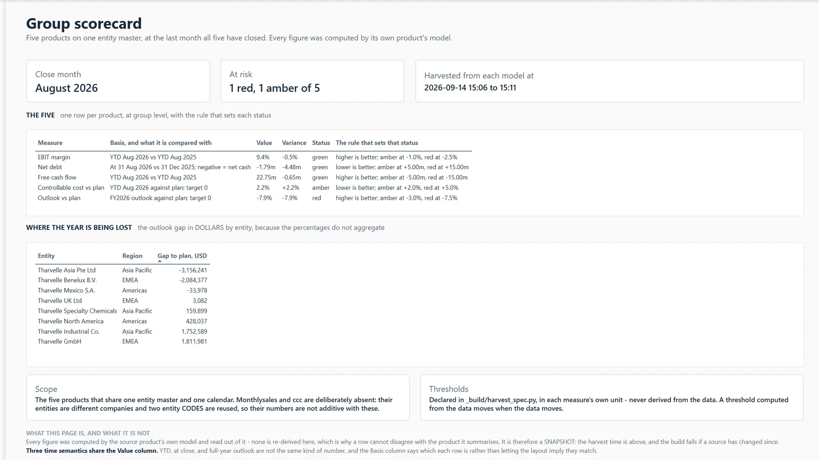
Our cash cycle improved 17 days. Did we get more efficient, or did someone squeeze the suppliers?
Example, generated data
Cash cycle · What changed
This page splits the move into receivable, inventory and payable days with no remainder. A gain bought by paying suppliers later shows as exactly that.
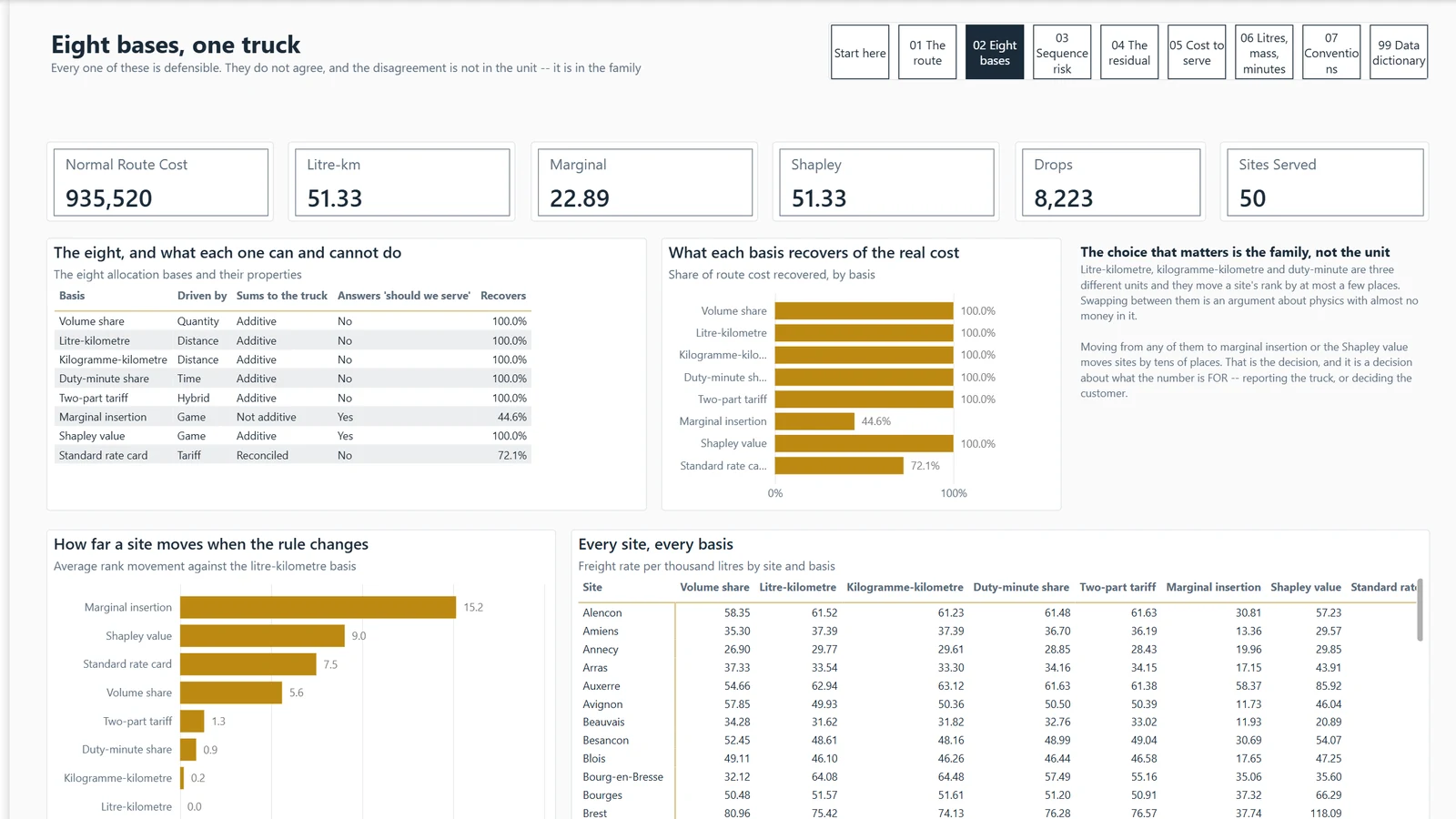
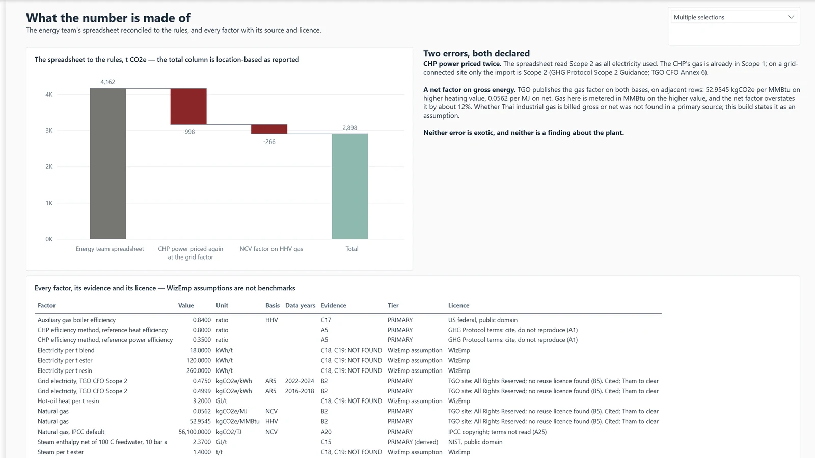
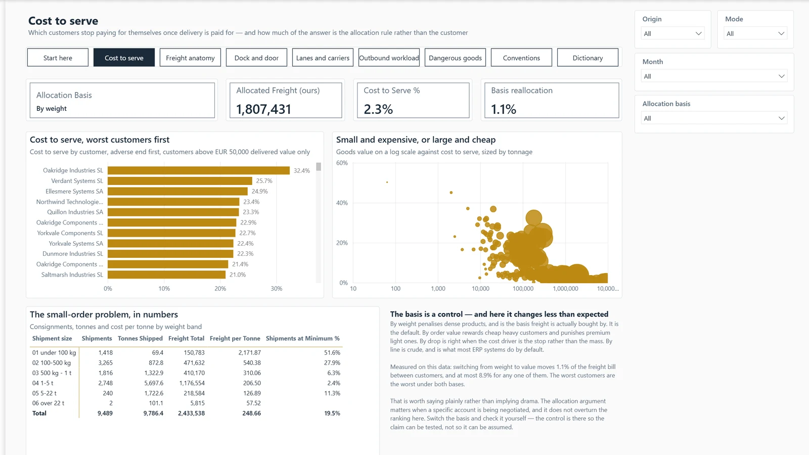
Our Thai plant costs 40% more than the Polish one for the same product. Is my plant worse at this?
Example, generated data
Cost to make · 02 Why it moved
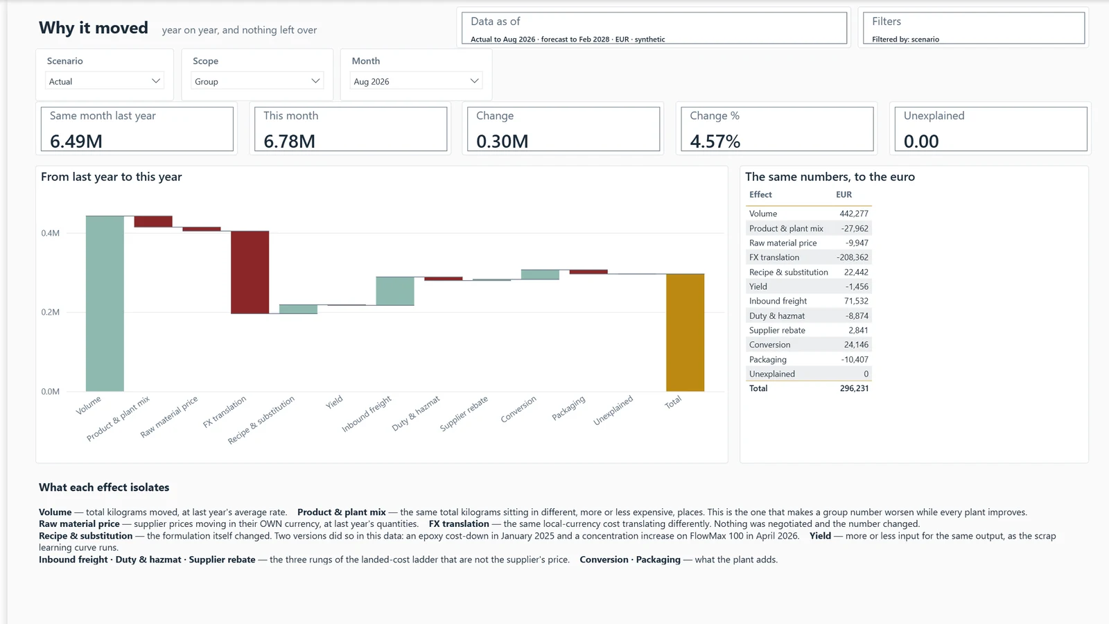
This page traces most of the gap to sourcing. Two plants make the main polymer in-house, and the others buy it in. The gap is mostly structural and passes no judgement on the plant.
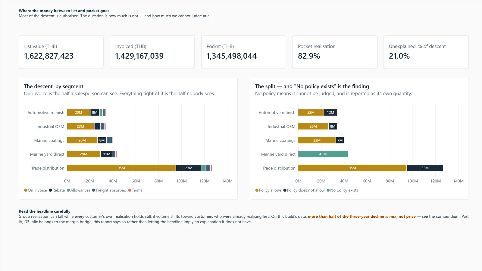
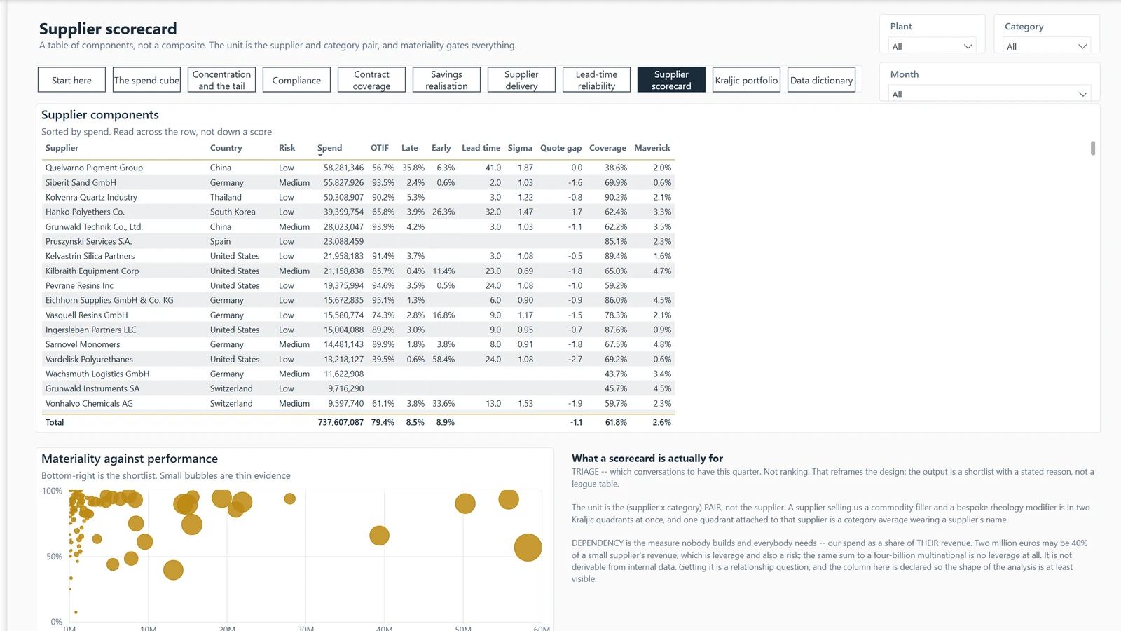
Between the price we publish and the money we keep, how much do we give away, and how much of it did we authorise?
Example, generated data
Price realisation · 01 Where the money goes
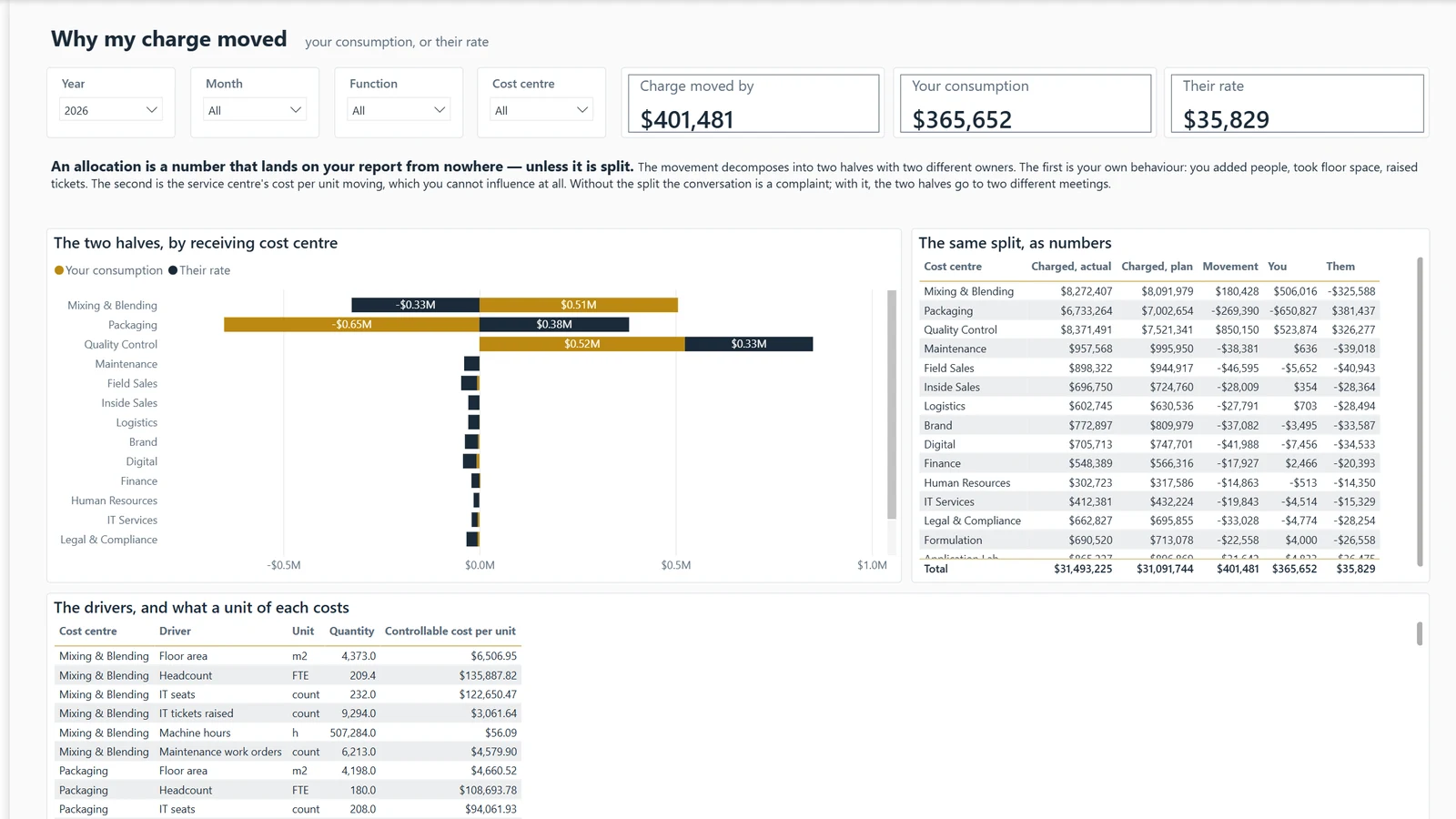
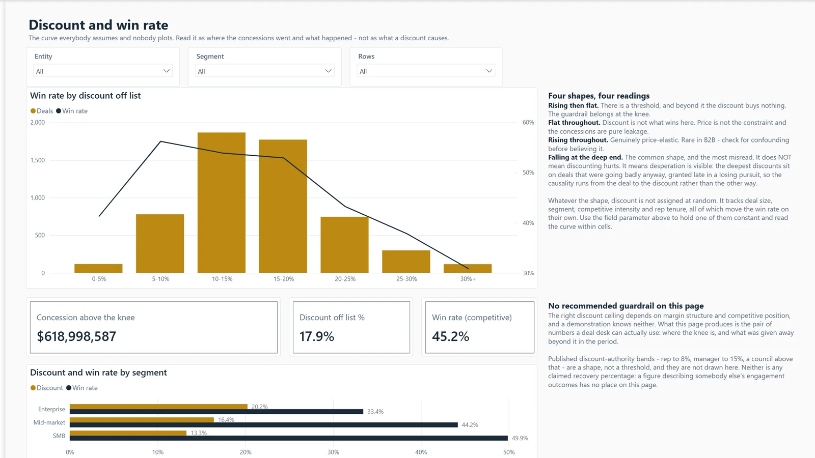
This page splits the drop from list price to pocket price into three parts. Policy allows some, some falls outside policy, and some has no policy at all.
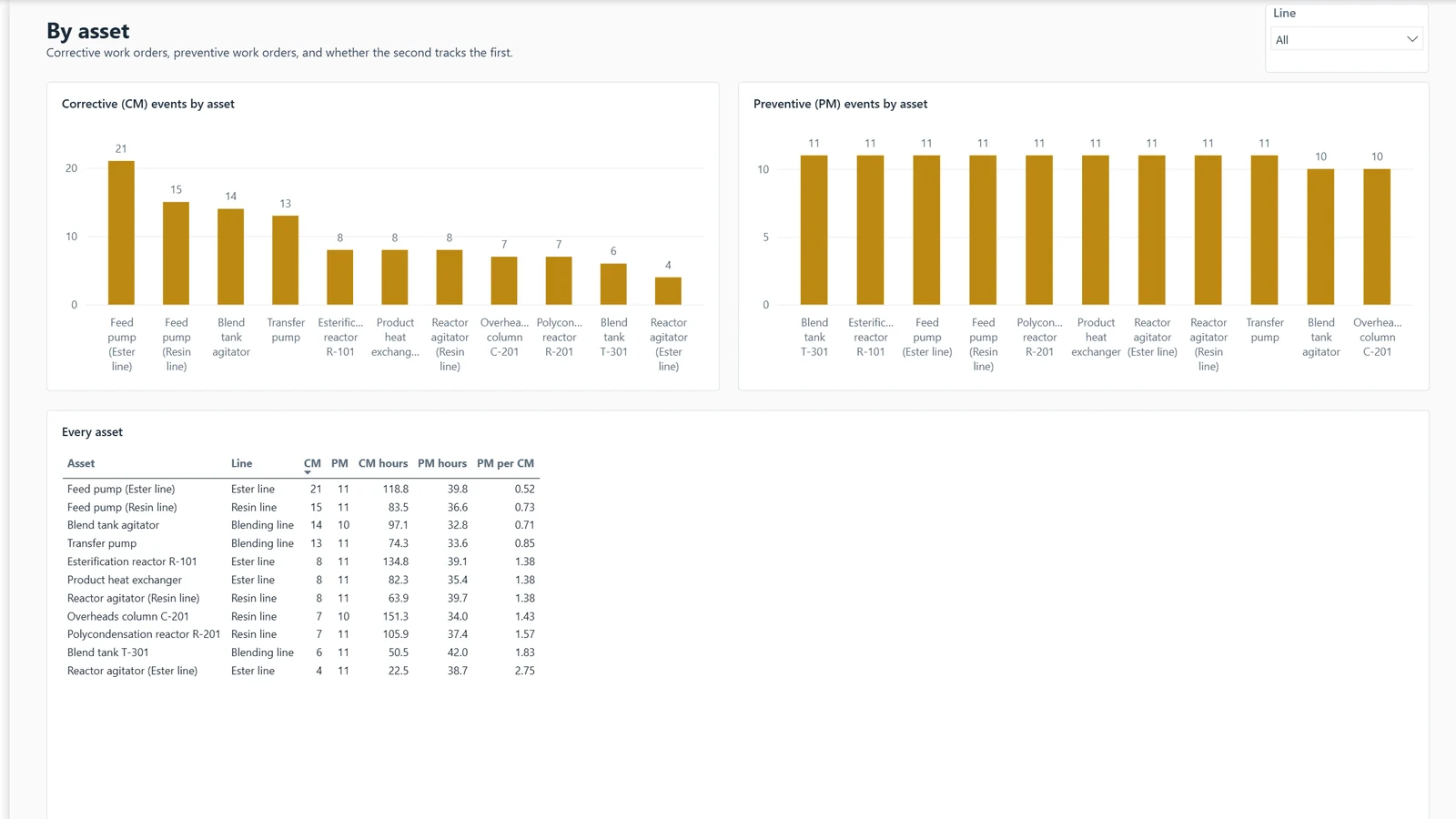
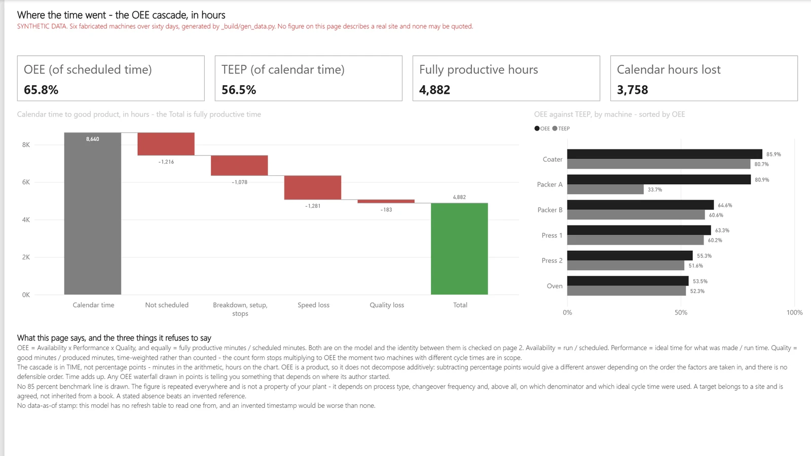
Downtime hours are flat on last year. So maintenance is under control?
Example, generated data
Maintenance and reliability · By asset
Flat hours hide the difference between an asset repaired once and one patched every six weeks. This page keeps corrective and preventive work apart for each asset.
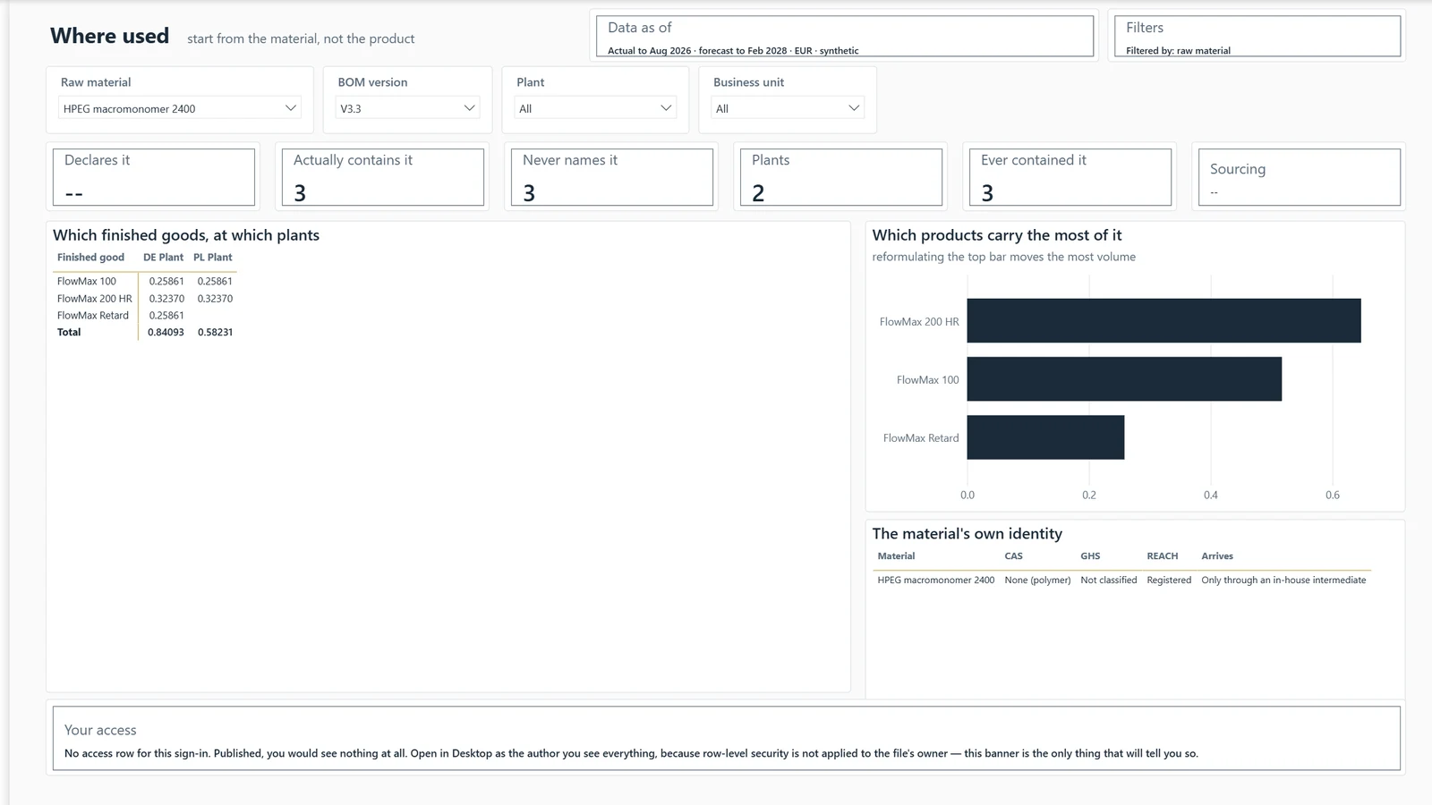
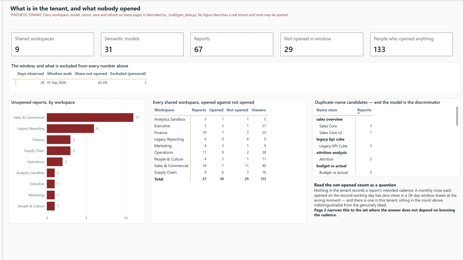
Four people once vanished from every manager's view. How do you know there is no fifth blind spot?
Example, generated data
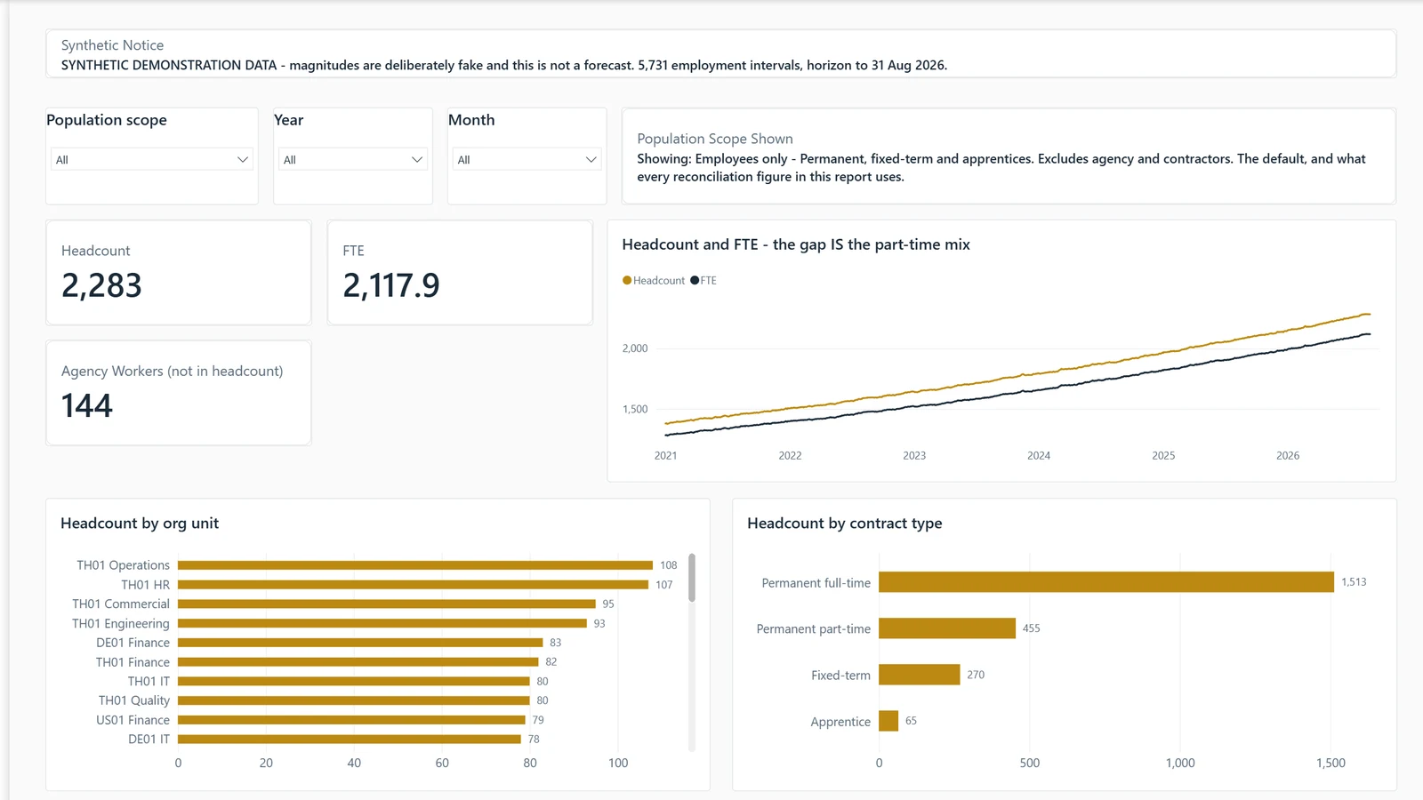
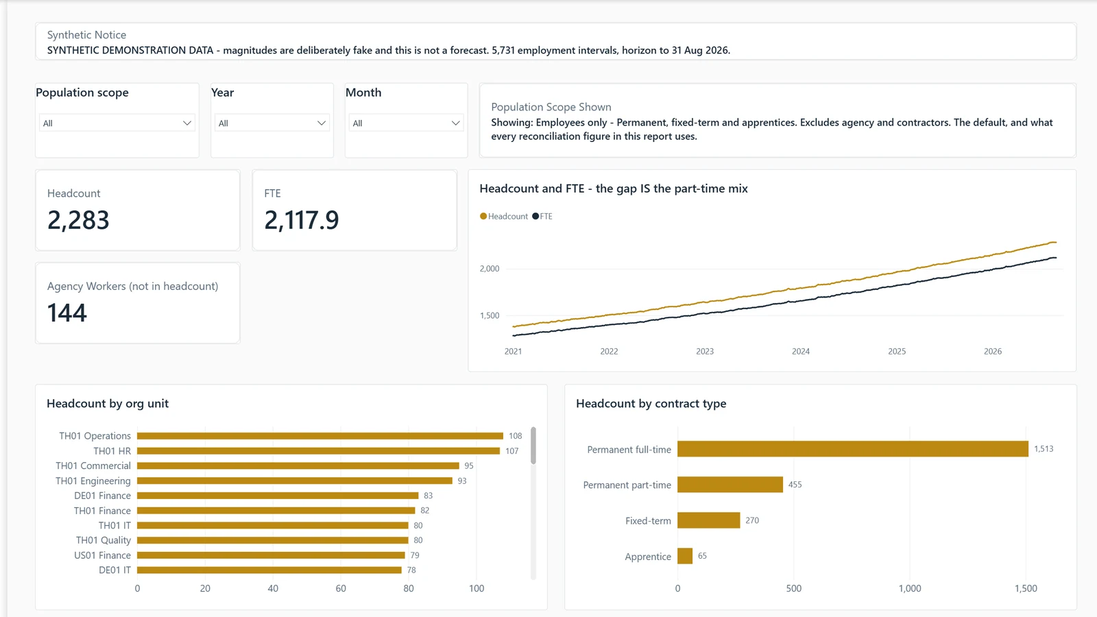
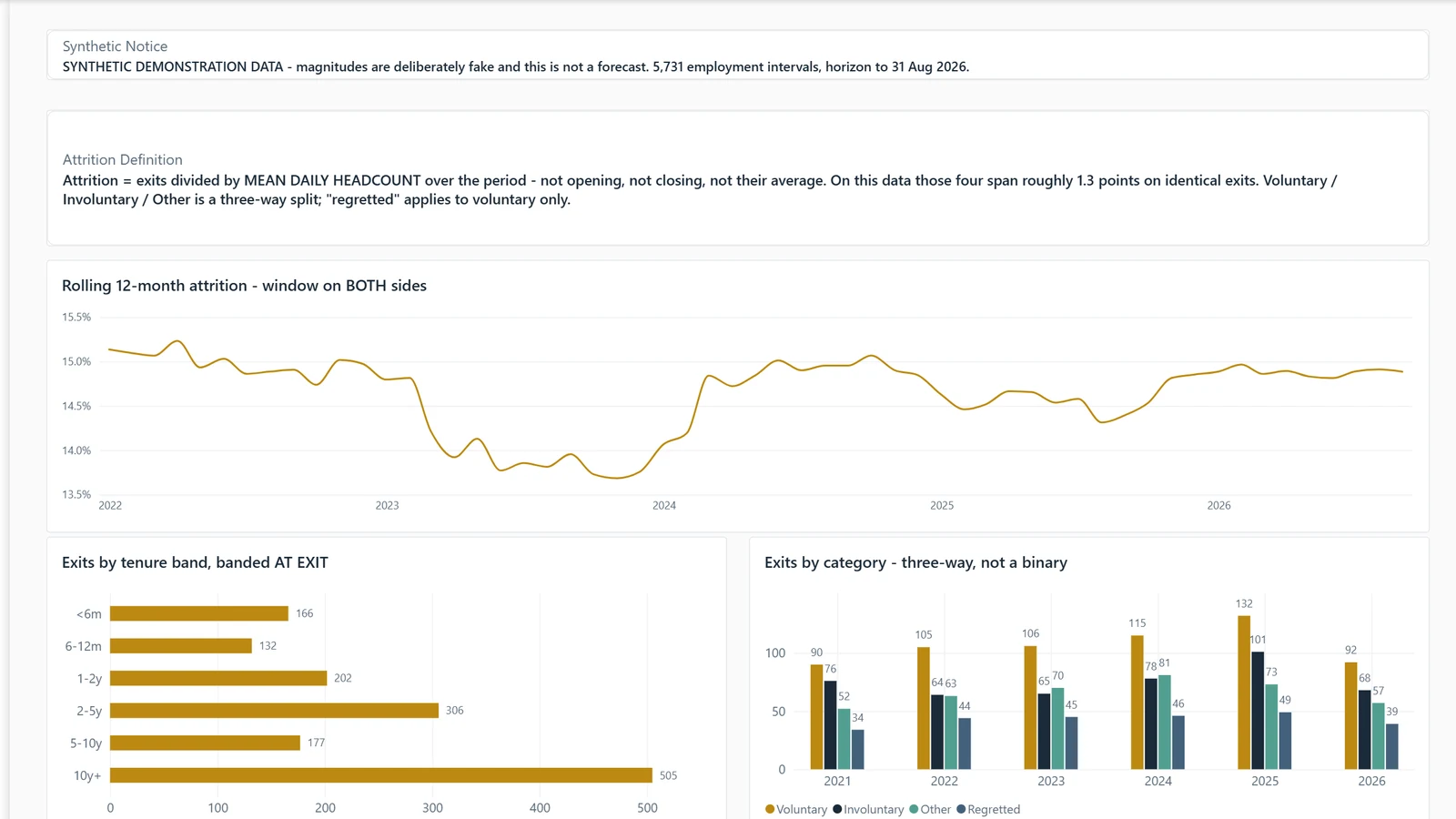
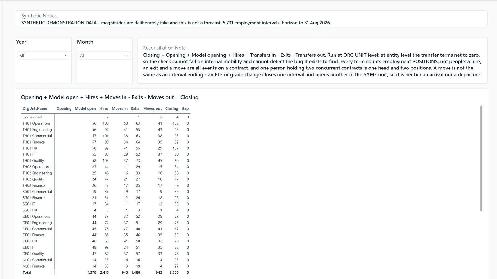
Headcount · Reconciliation
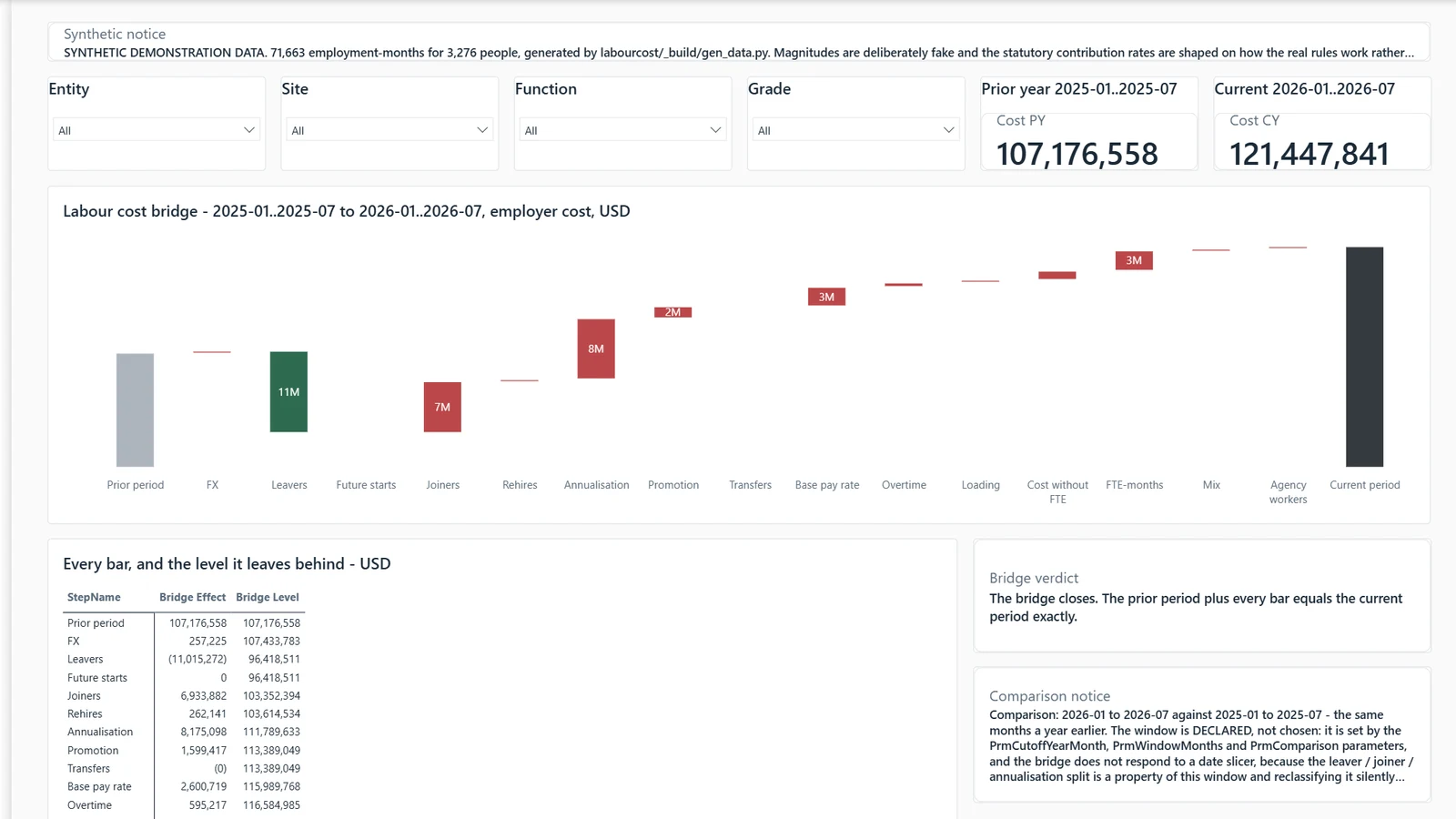
Every person now sits in a unit someone owns. The four sit in an Unassigned row on the Reconciliation page, with a named owner. The page shows the fix and does not prove there is no fifth gap.
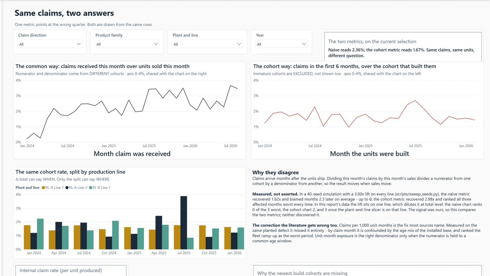
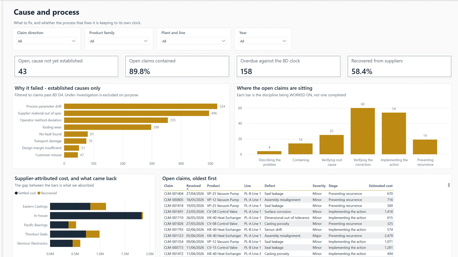
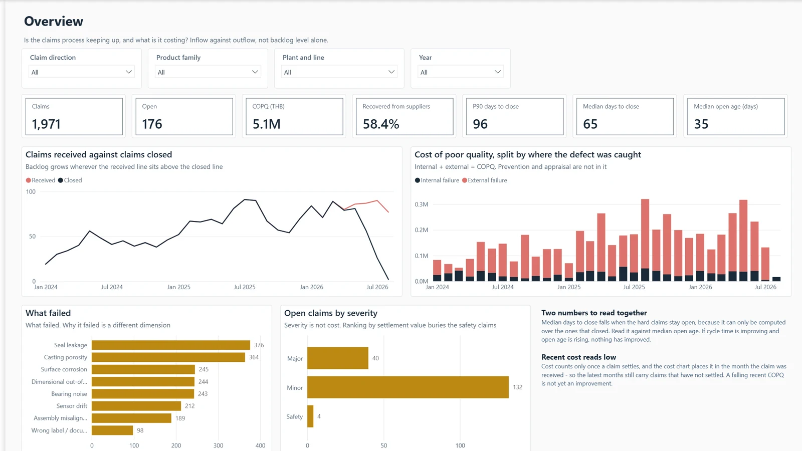
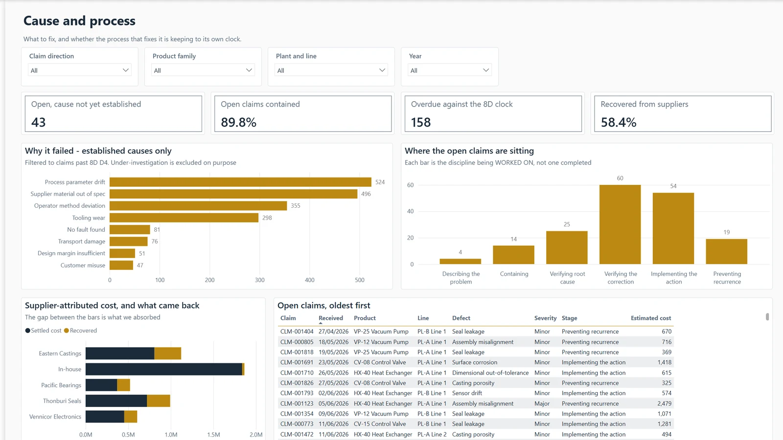
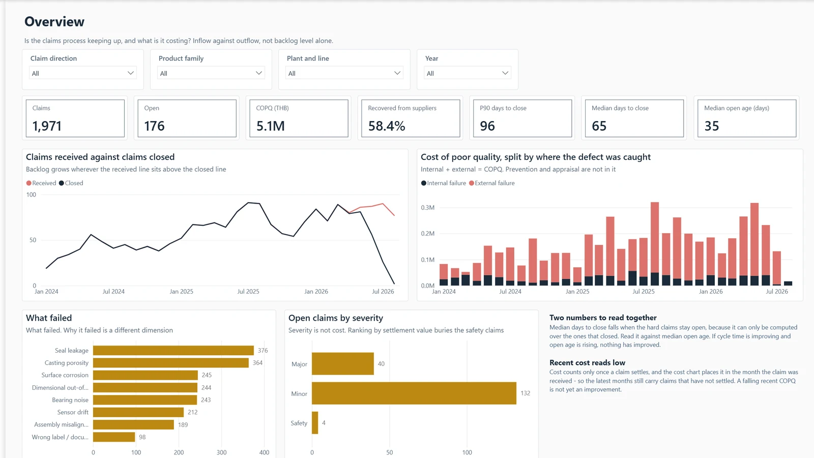
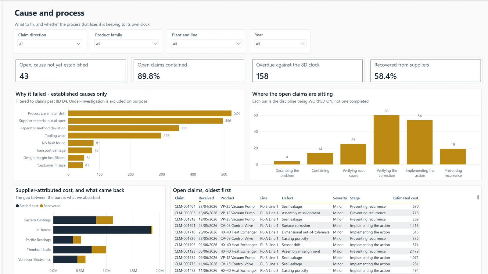
Claims spiked this quarter. Which production month do I send the team to investigate?
Example, generated data
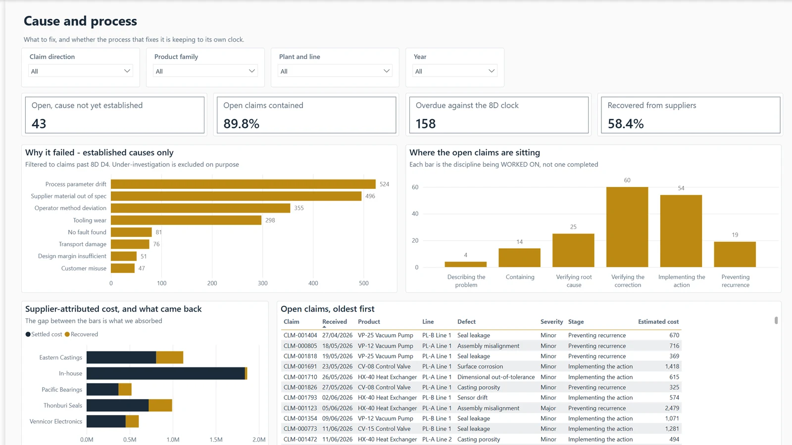
Claims · Same claims, two answers
Claims by build month sit beside the naive claim rate. Over 40 generated runs, the build-month view found the planted months every time and the naive rate none.
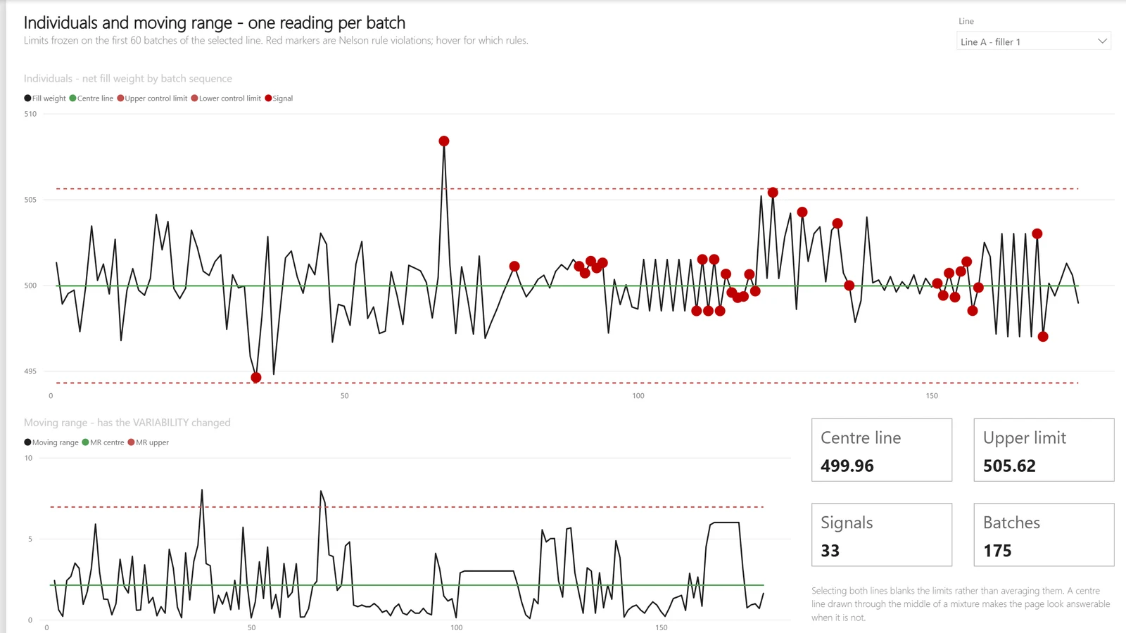
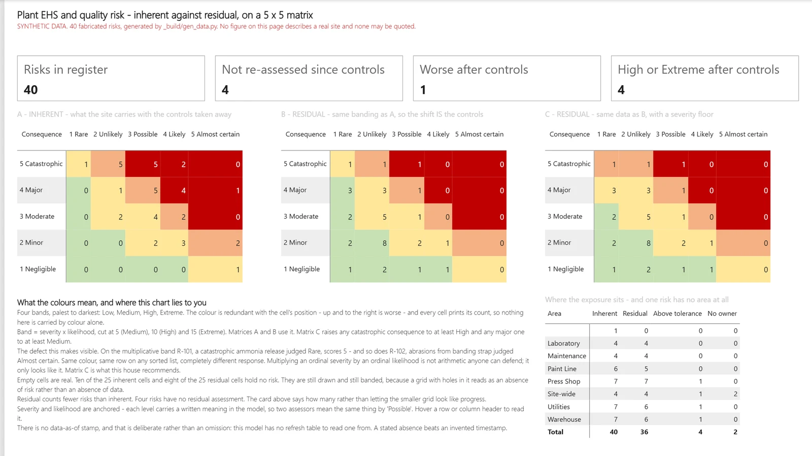
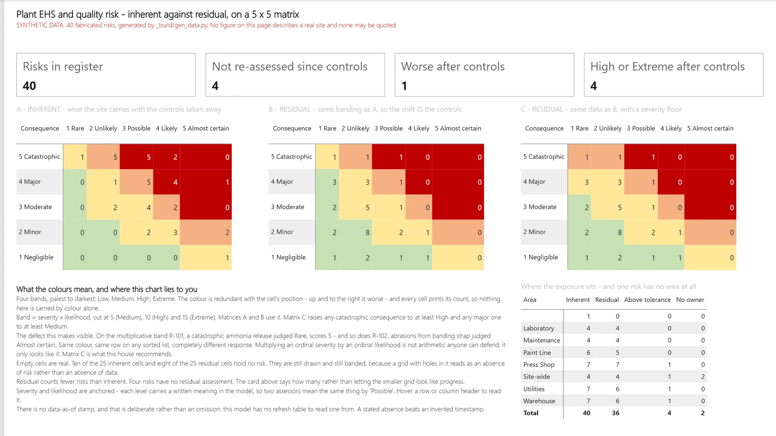
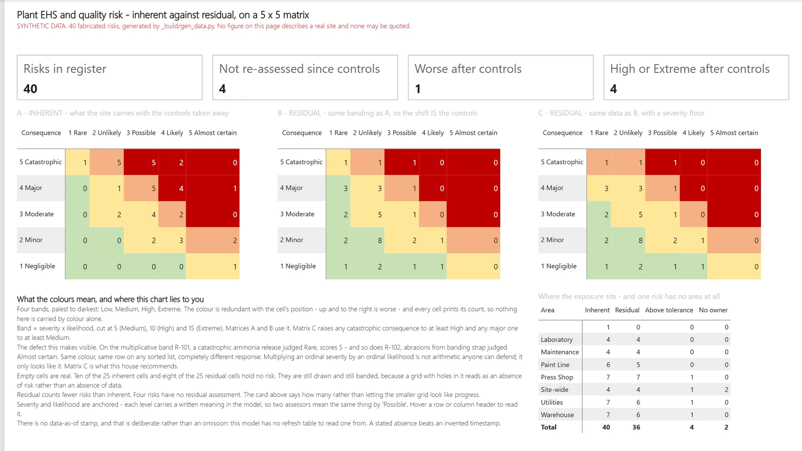
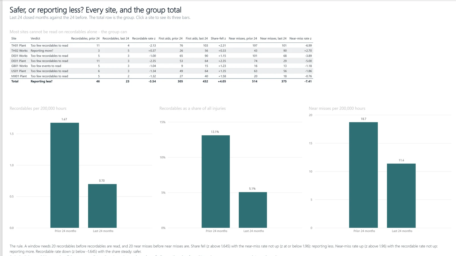
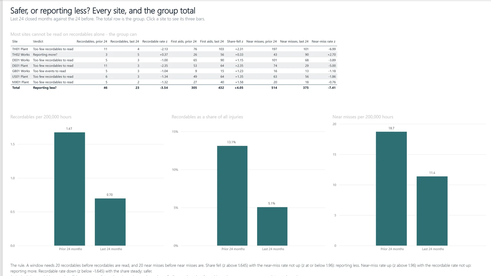
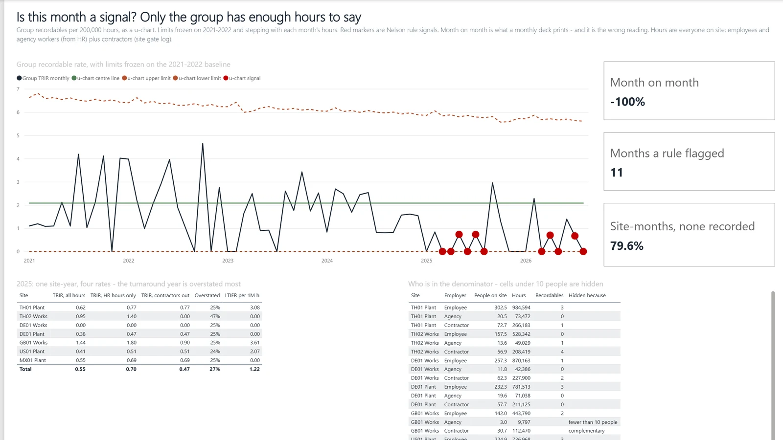
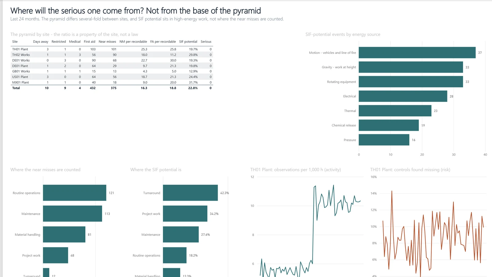
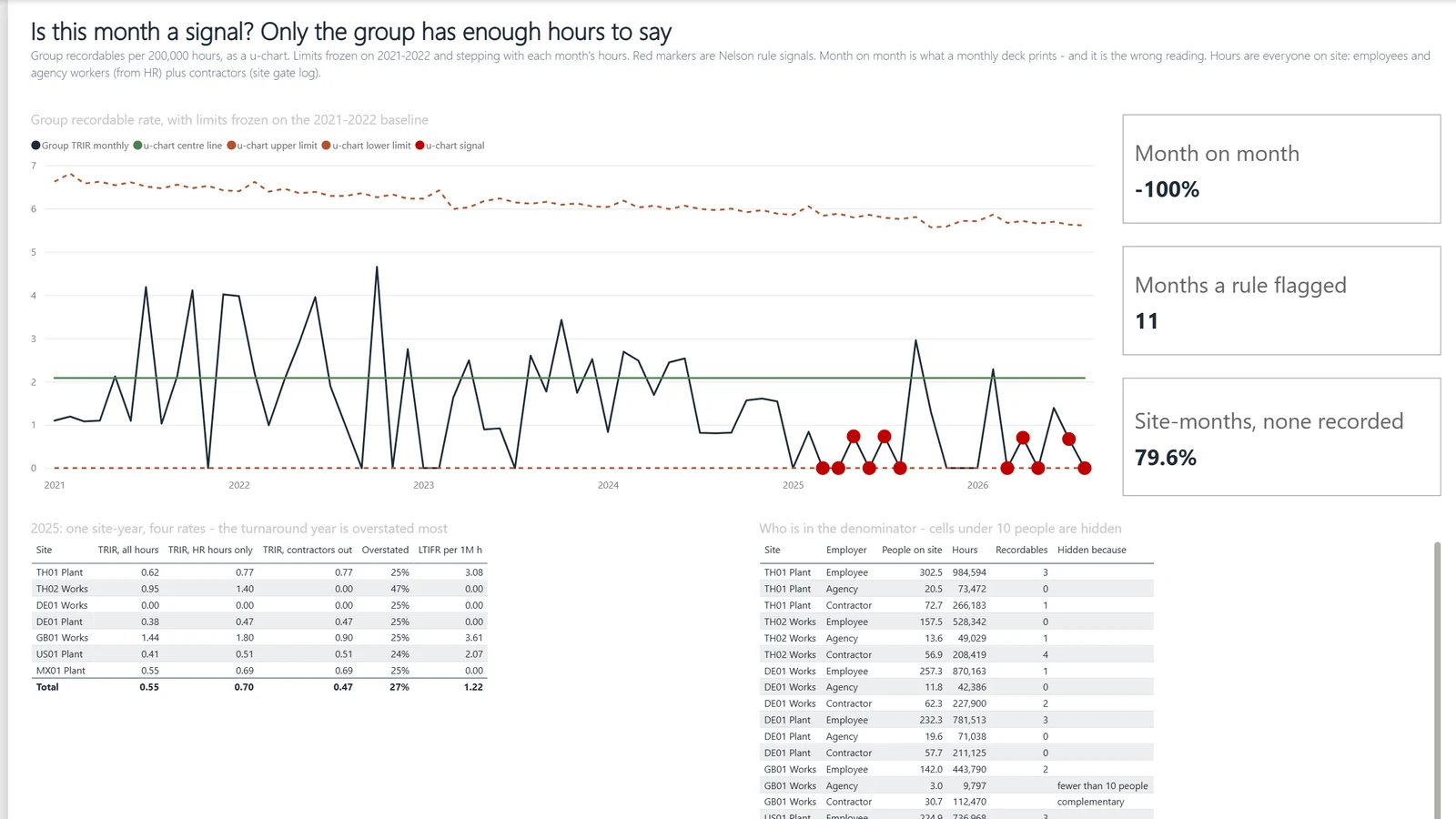
Our TRIR is down again. Are we safer, or are people reporting less?
Example, generated data
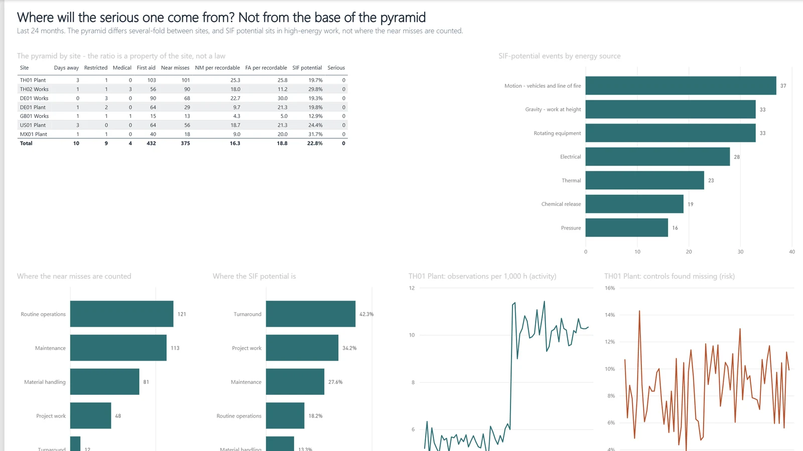
HSE leading indicators · 2 Safer, or reporting less?
The verdict reads three figures together: the recordable rate, the recordable share of injuries and the near-miss rate. Its hit rate on planted cases is printed on the first page.
In thirty minutes we sort your questions into three piles. A report answers some on your data. Some need a split built for them. Your data cannot settle the rest yet.